Citizens for Kevin Corlew - Campaign Photos
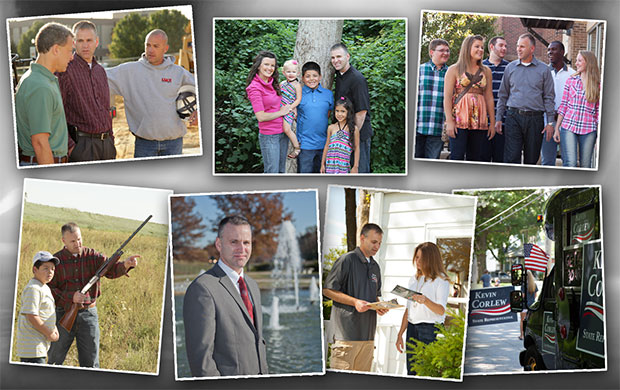
Multiple photo sessions have been conducted over the last three campaigns. During that time I have been the principal photographer. The majority of the work has been on location.

Multiple photo sessions have been conducted over the last three campaigns. During that time I have been the principal photographer. The majority of the work has been on location.
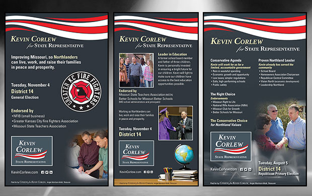
Multiple newspaper ads were ran in three different publications during the 2014 campaign.
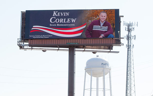
Two billboards were produced during the 2014 campaign, a 14'x40' digital display was first produced, followed by a 14'x48' vinyl wrap. While the viewed dimensions are similar, the technical requirements are not. The vinyl follows traditional guidelines, huge file, ink printed in a reflective vinyl. The digital is quite different, dots the size of silver dollars are used render art that is half the size of most modern smart phone screens. Colors tend to wash out during the day and over saturate at night.
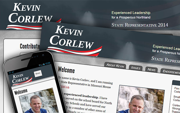
The fourth version of the site was launched with the 2014 campaign. Solid branding standards had now become established. Built on the Drupal framework, it features a blog style news feed, events lists, multiple forms for user feedback, and integration with Twitter. The slate grey theme, features night time shots of the Northland Fountains as a background. The site was also built with "responsive" methods, allowing it to smoothly transition form display on a desktop device to a mobile phone.
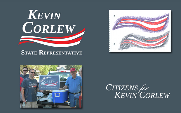
An original logo and logotype was developed for the campaign. Early in the process the Tinos web font was identified and picked, allowing the same face to be used in print and online. Before the decision to develop an icon was made, the logotype was rendered in all caps, with the England Hand web font used on the script "for". Later it was decided to develop an icon version, and to avoid dominant partisan colors. It still needed energy and pop; and a stylized waving flag provided both.
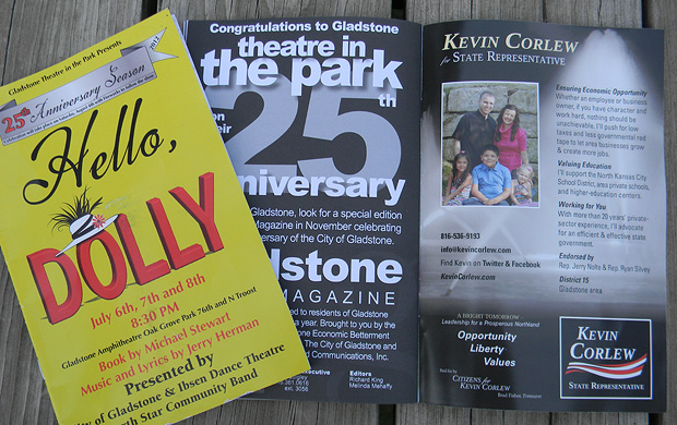
This full color ad ran as the inside back cover for the Gladstone Theatre in the Park summer play series. The ad was 5"x 8" and utilized 2 photos I had previously shot.
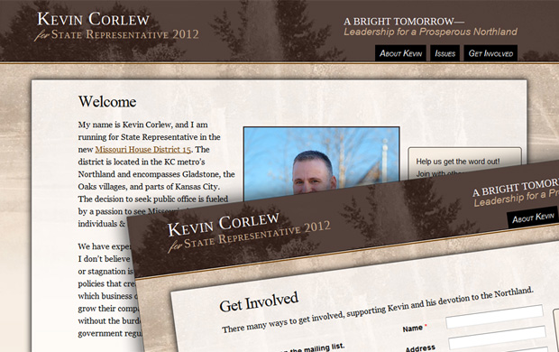
This initial version of the site was put together very early in the 2012 campaign, before any real branding decisions had been made. It was deemed more important to have a way to begin collecting contributions to the campaign and then work out the details once things got moving. We wanted to avoid the typical labels associated with partisan color schemes and push local imagery. The Northland Fountains were an easily identifiable icon in the district and used in one of our previous photo sessions, and incorporated as texture into the site.
Site Design & Contents Copyright 2000-2021. All Rights Reserved. HaloFX Media LLC